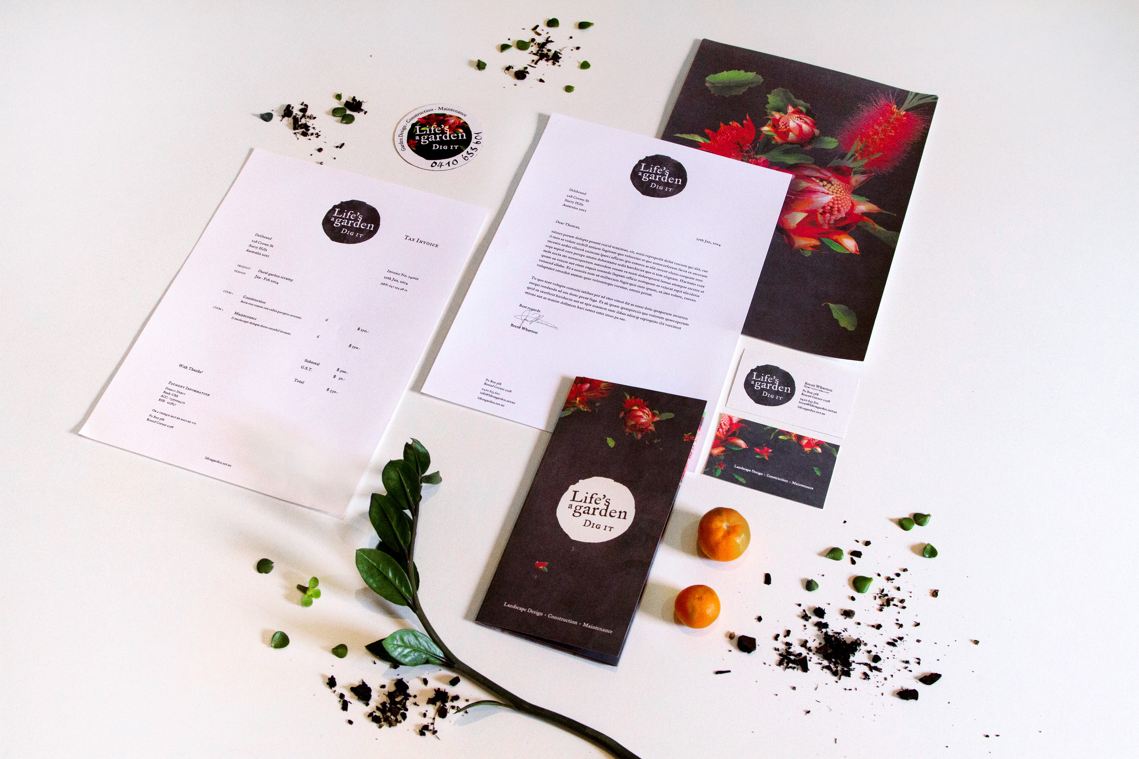
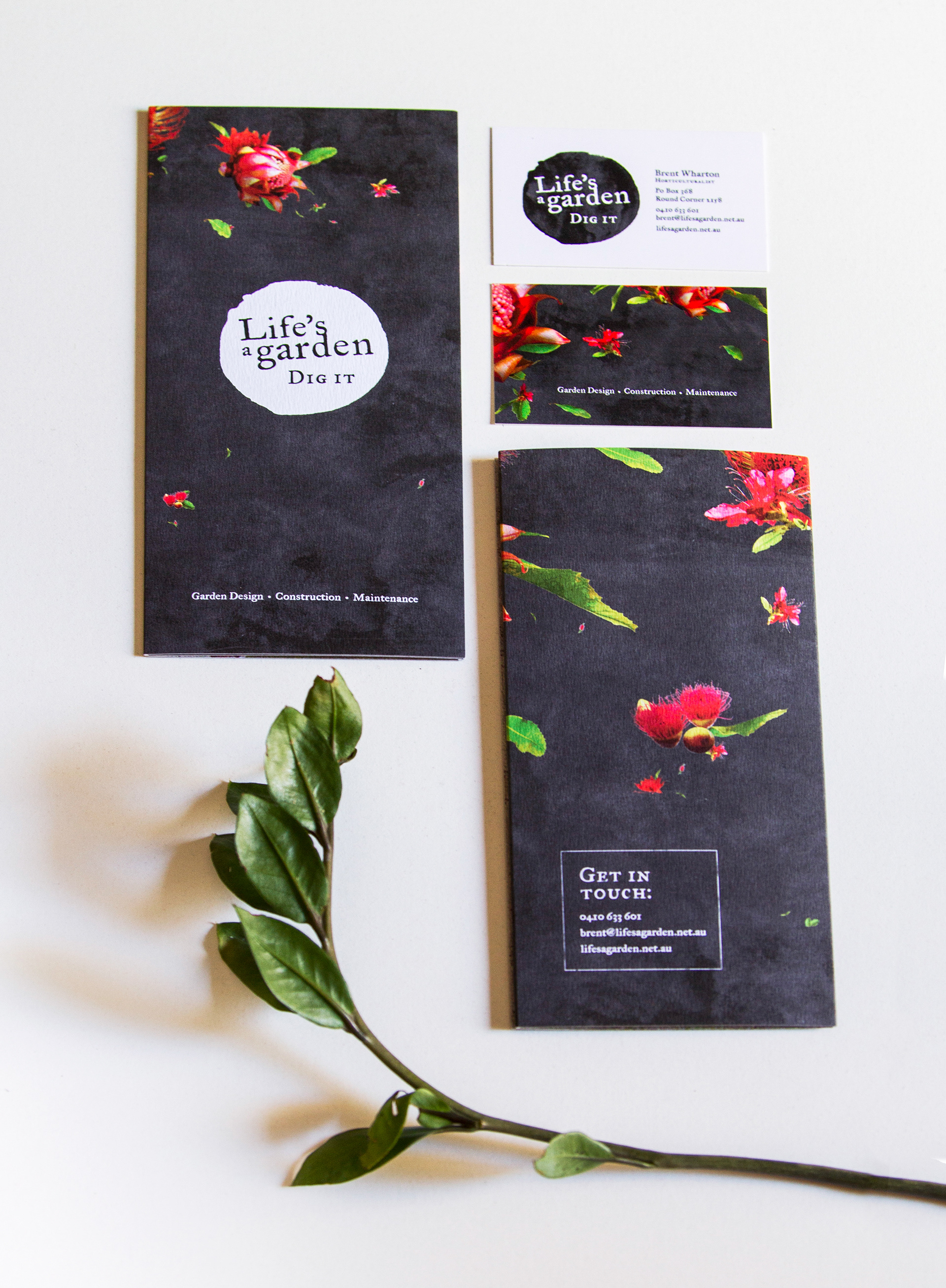
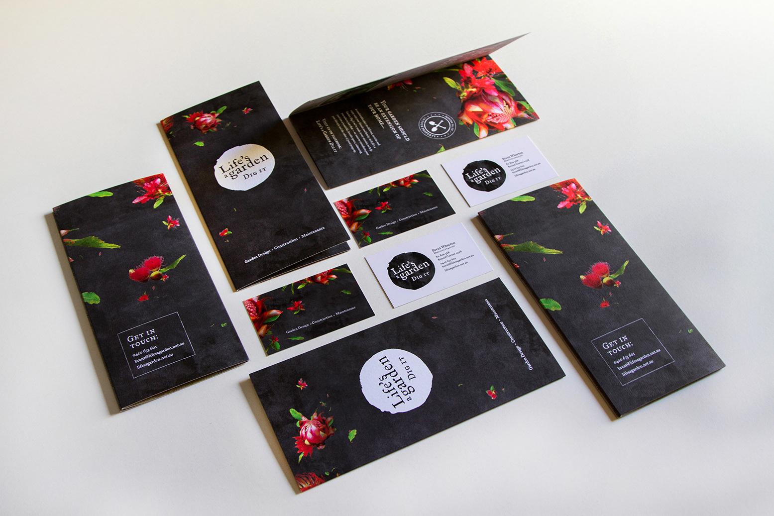
A in Sydney created corporate design for a garden design, construction & maintenance business, in which the organic and „hands-on“ character of the occupation is reflected. Inspired by this „analogue“ approach, I created a logo shape based on a potato/onion stamp print. The florale illustrations demonstrate the company’s artistic and creative side. Deliberately we tried to step away from the mass of green logos, which are very present in this business, by focusing on the fiery red of the native flora.